Design | Web
RestorePDX
UI Design | Website Design | Wireframes | WordPress Divi Developer
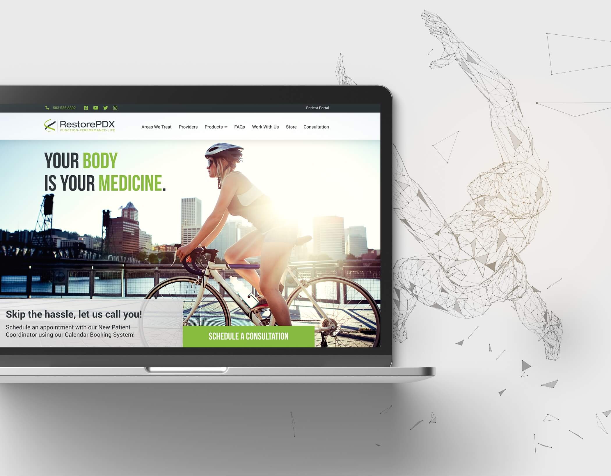
RestorePDX’s new modernized design and updated online presence, prioritizing patient engagement.
Situation.
My Approach.
We set out to discover the most valuable content for our users and organized it strategically to align with their journey. Through some user research, we crafted a simple sitemap, offering a bird’s-eye view of user pathways. We then developed a series of wireframes to visualize user interactions, pinpoint content requirements, and showcase clear routes toward actionable goals. Once the wireframes got the green light, we generated design options for both the homepage and internal pages, sticking closely to those wireframes. The chosen design underwent refinement rounds until approval, marking the transition to the site’s development phase.
Planning.
Wireframes are vital in developing content structure. Here, we used wireframes to streamline user journeys. Specifically, the ‘What Questions Do You Have Today?’ section pinpoints user personas and swiftly guides them to their destination. During the wireframing process, we found ways to improve user engagement.

Colors.
Typography.
ABCDEFGHIJKLMNOPQRSTUVWXYZ
Bebas Neue
ABCDEFGHIJKLMNOPQRSTUVWXYZ
abcdefghijklmnopqrstuvwkyz
Roboto
